Balance and harmony are crucial for creating a visually appealing space. Understanding the principal of proportion can elevate any room to new heights. A principal that designers swear by is called the 60/30/10 rule.
What exactly is this rule and how can you apply it in your home? Let’s dive into this concept and explore the significance it can make in creating a cohesive space anywhere.

The basics of the 60/30/10 rule
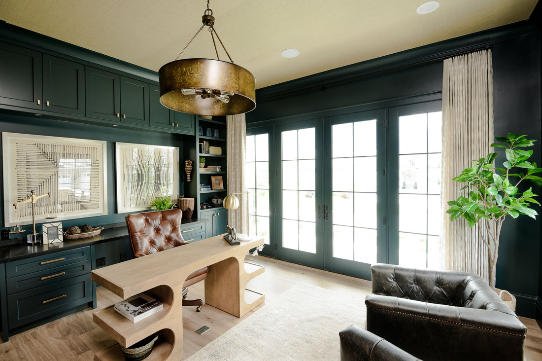
The 60-30-10 rule is a simple guideline used to create a balanced color scheme within a space. It dictates that a well-designed room should be composed of approximately:
- 60% of a dominant color
- 30% of a secondary color
- 10% of an accent color
This rule helps designers strike the right balance between various hues, preventing the space from feeling overwhelming or disjointed.

Applying the Rule in Interior Design
In interior design, the 60-30-10 rule is a valuable tool for selecting paint colors, furniture, accessories, and textiles. Let's see how it can be applied in practice:
Dominant color (60%) : This color sets the tone for the space and serves as the primary backdrop. It's typically used on walls, large furniture pieces, or flooring. Neutral colors like beige, gray, or white often work well as dominant hues, providing some space for variety when selecting the rest of the design elements.
- Wall Treatments: Choose a paint color or wallpaper pattern that sets the desired mood for the space. Opt for neutral tones like soft greys, warm beige, or creamy whites to create a versatile backdrop that complements various decor styles.
- Large Furniture Pieces: Select upholstery fabrics or finishes for major furniture items such as sofas, sectionals, and dining tables. Consider muted or earthy tones that seamlessly blend with the dominant color, anchoring the room with a sense of cohesion and tranquility.
- Flooring: Whether hardwood, laminate, tile, or carpet, the flooring serves as an expansive canvas for the dominant color. Choose flooring materials and finishes that harmonize with the overall color palette, enhancing the visual flow and spaciousness of the room.
Secondary Color (30%): The secondary color complements the dominant hue and adds depth and visual interest to the room. This could be incorporated through drapes, romans, upholstery, rugs, or accent walls. Designers often opt for colors that contrast or harmonize with the dominant shade, creating a cohesive yet dynamic look.
- Window Treatments: Drapes or romans offer an opportunity to infuse the secondary color into the room. Select window treatments in complementary tones or patterns that enhance the overall design scheme while providing privacy and light control.
- Upholstery and Soft Furnishings: Introduce the secondary color through upholstered furniture pieces, such as accent chairs, ottomans, or throw pillows. Opt for fabrics with textures or patterns that incorporate the secondary hue, adding depth and visual interest to the space.
- Accent Walls: Create focal points within the space by painting an accent wall in the secondary color. This technique adds drama and dimension to the room, drawing attention to specific architectural features or decorative elements.
Accent Color (10%): As the name suggests, the accent color is used sparingly to add personality and vitality into the space. It comes out in small doses through accessories, throw pillows, artwork, or decorative accents. Bold or vibrant hues are commonly chosen for accent colors, as they draw attention and infuse energy into the design of the room.
- Decorative Accessories: Integrate pops of the accent color through carefully curated accessories such as vases, artwork, decorative bowls, or table lamps. These small yet impactful accents add personality and visual intrigue to the room, inviting exploration and discovery.
- Textiles and Rugs: Incorporate accent-colored textiles into the space through area rugs, throws, and decorative cushions. Look for patterns or textures that feature the accent hue, adding warmth and vibrancy to seating areas or bedrooms.
- Artwork and Decorative Accents: Showcase artwork or decorative accents that highlight the accent color, serving as focal points within the room. Whether through abstract paintings, sculpture pieces, or statement decor items, these accents infuse the space with personality and charm.
I hope this blog post gave you a better understanding of harmony in a home and how to achieve it! There are endless options when it comes to colors, patterns, & textiles… but using the 60/30/10 rule can narrow down your selections to help you create a home that fits your style while still being cohesive.
With this information, you can be confident in ordering swatches for your window treatments knowing which color/pattern will best suit the space. If you have any questions, don’t hesitate to email us at info@uptowndrapes.com.